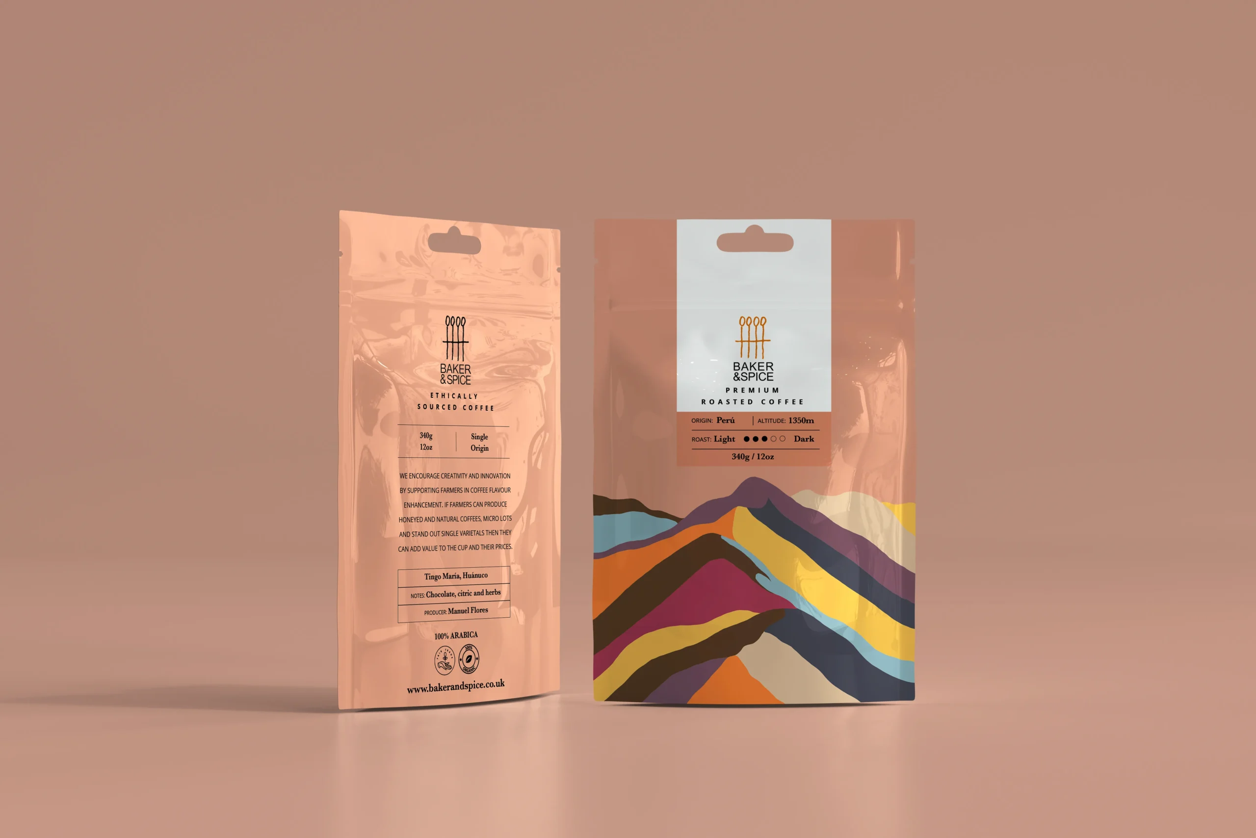
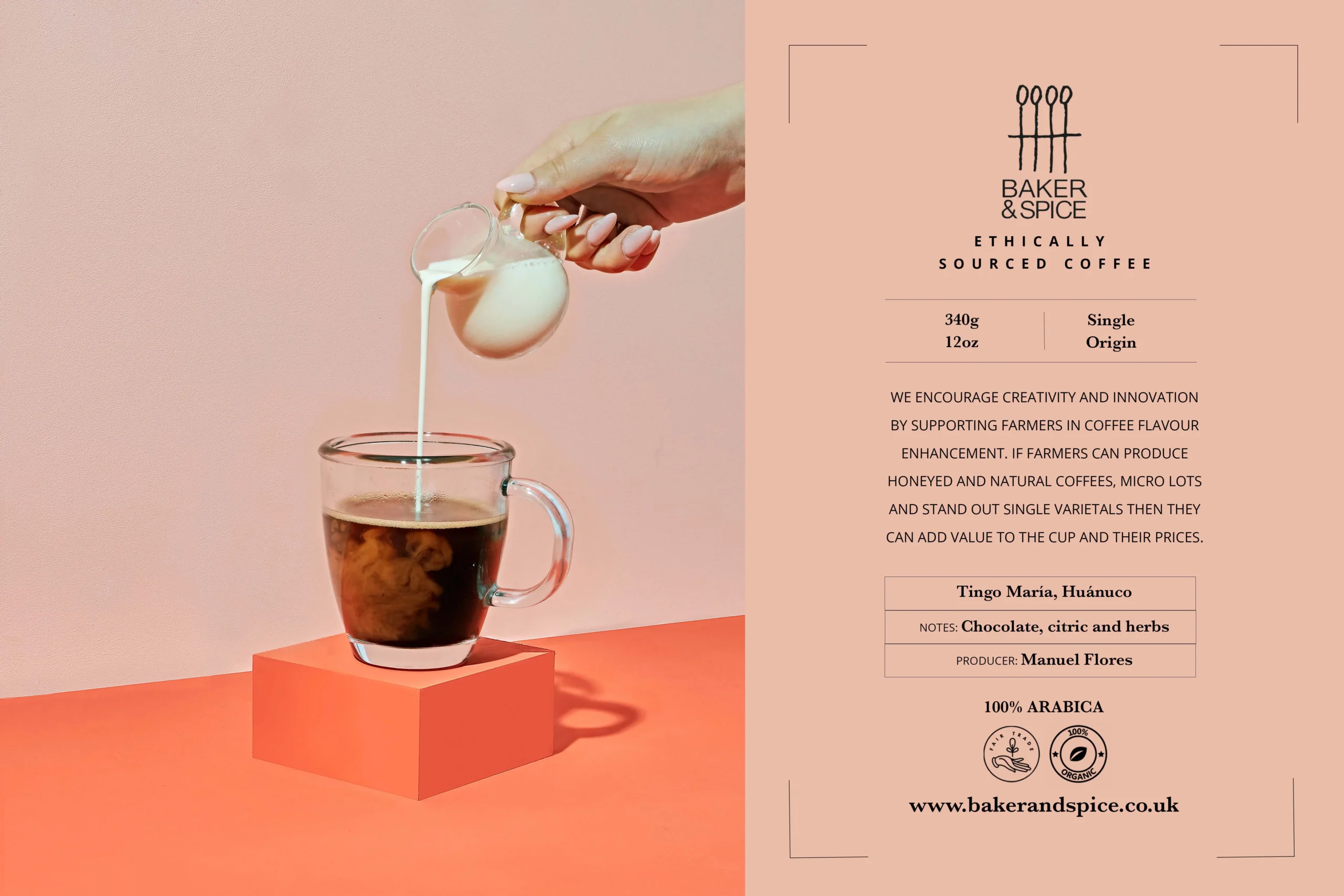
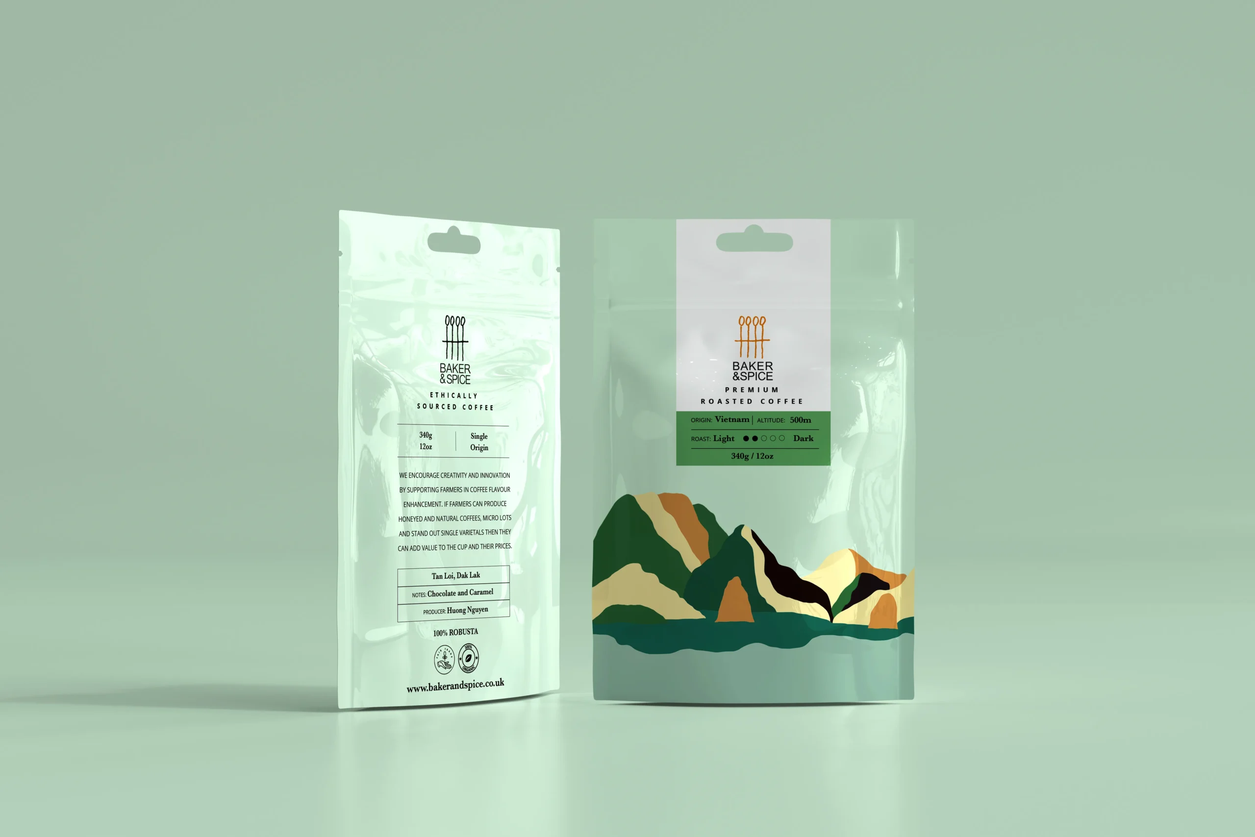
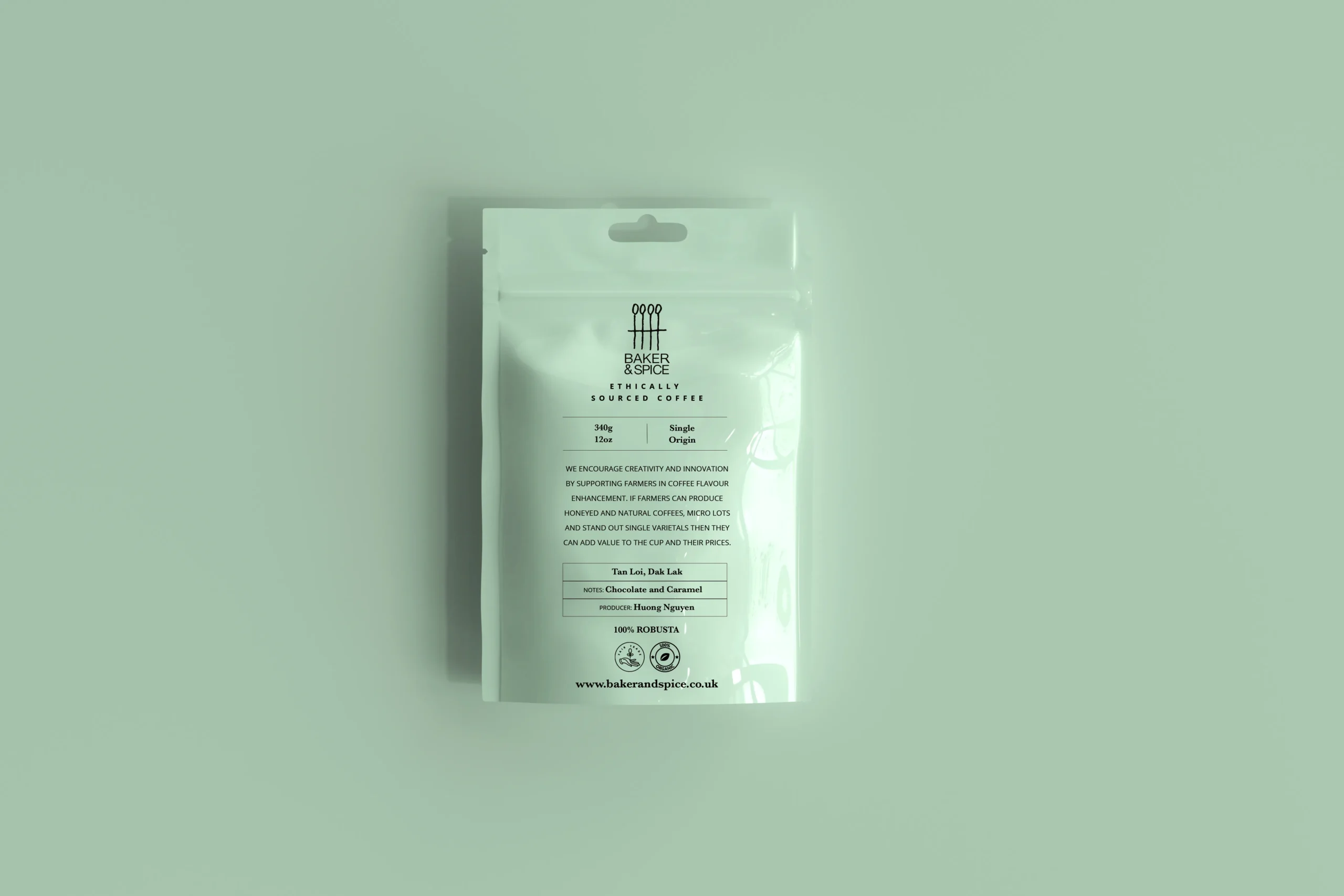
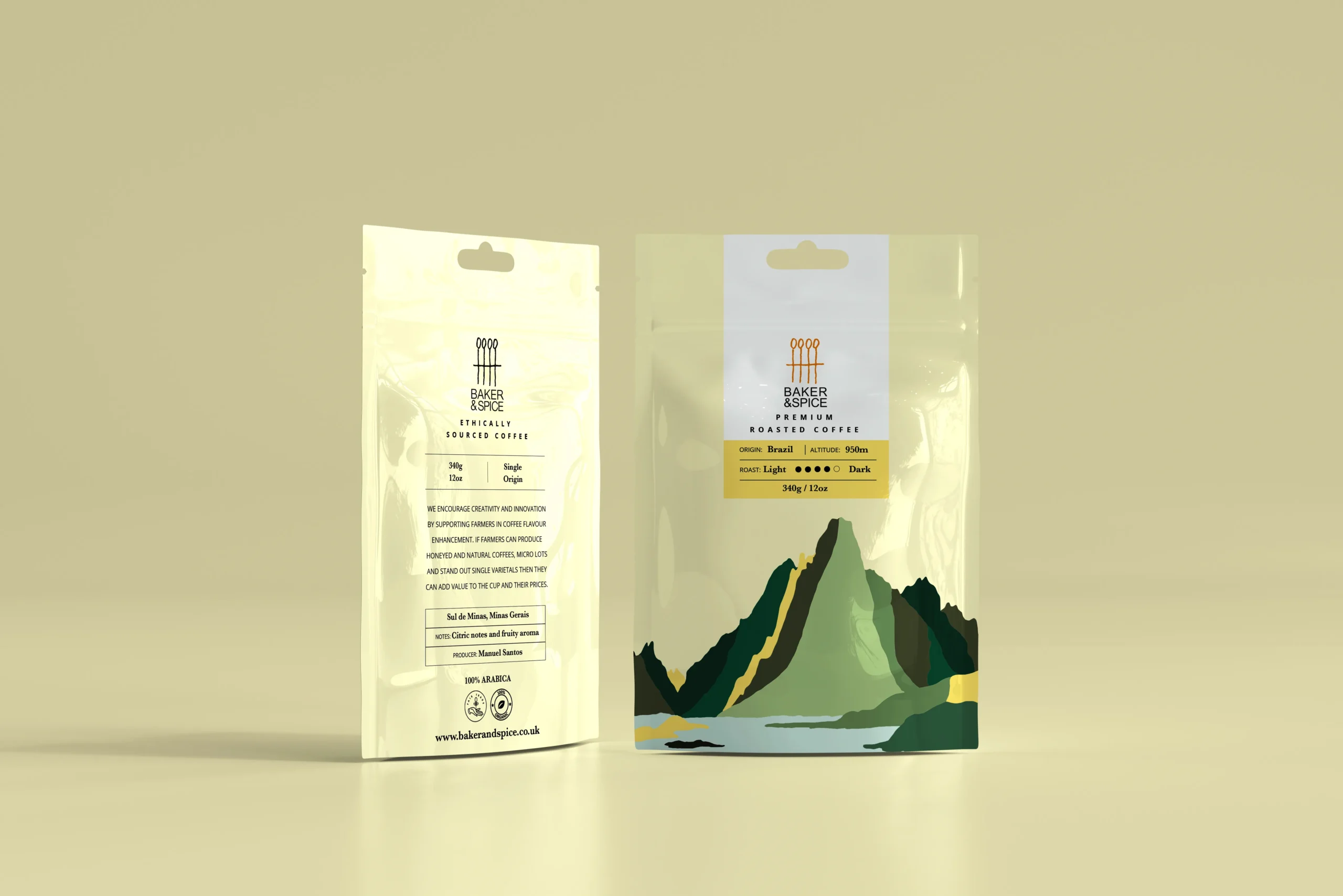
For Baker & Spice in the UK, the challenge was to design coffee packaging that reflects the coffee’s origins and culture while appealing to the target audience.
To achieve this, I chose to draw and incorporate illustrations of a scene that ties in all of the country’s elements in harmony. This approach creates a visual story that captures the essence of each country and its coffee culture. By choosing iconic sceneries from each country, the packaging design becomes more relatable and memorable to customers.
The use of bright colors in the illustrations gives the packaging a fresh and modern feel. This approach is ideal for coffee packaging, which often appeals to younger and more adventurous consumers. I chose a color palette that complements each country’s scenery, creating a cohesive design that feels natural and authentic.
The choice of a silky finish for the packaging adds a touch of luxury to the overall design. This approach elevates the product and creates a premium feel that aligns with the Baker & Spice brand. It also makes the packaging stand out on shelves, making it easier for customers to notice and pick
